Optimise your Magento 2 store for mobile to boost rankings, increase conversions, and generate more leads. Learn proven strategies to improve speed, UX, and sales in 2025.
Having a mobile-friendly website is no longer a luxury, it’s a must for every business owner. Most shoppers today browse and buy directly from their phones, often while on the move. If your Magento 2 store doesn’t deliver a smooth mobile experience, chances are you’re losing both visitors and sales.
High-quality visuals, clean design, and fast-loading pages play a vital role in keeping customers engaged. People rarely have time to scroll through large chunks of content or deal with clunky layouts. They want quick access, clear information, and an easy checkout, all from any device, anywhere.
Magento 2 makes this possible. With its advanced features, responsive themes, and extensions like the Magento 2 Accelerated Mobile Pages (AMP) extension, you can create a lightning-fast, mobile-optimised site that delights your customers and meets Google’s latest performance standards.
In this article, we’ll walk you through how to make your Magento 2 website mobile-friendly, from responsive design and speed improvements to AMP integration, so you can deliver a seamless experience that drives real results in 2025 and beyond.
Why Your Magento 2 Store Must Be Optimised for Mobile Users?
Optimising your Magento 2 store for mobile devices is no longer a nice-to-have, it’s an absolute must. With mobile commerce (m-commerce) now driving the majority of online sales, a poor mobile experience can cost you traffic, leads, and revenue.
Recent data shows that over 70 % of eCommerce traffic in 2025 comes from mobile devices, and more than 60 % of online purchases are completed through smartphones. That means if your Magento store isn’t mobile-ready, you’re missing a massive slice of potential business.
Magento 1 struggled to deliver true mobile responsiveness. However, Magento 2 changed the game. It introduced a modern, mobile-first framework that allows store owners to design responsive layouts, use lightweight themes, and integrate advanced tools like the Magento 2 Accelerated Mobile Pages (AMP) extension. This helps your pages load faster and meet Google’s performance benchmarks.
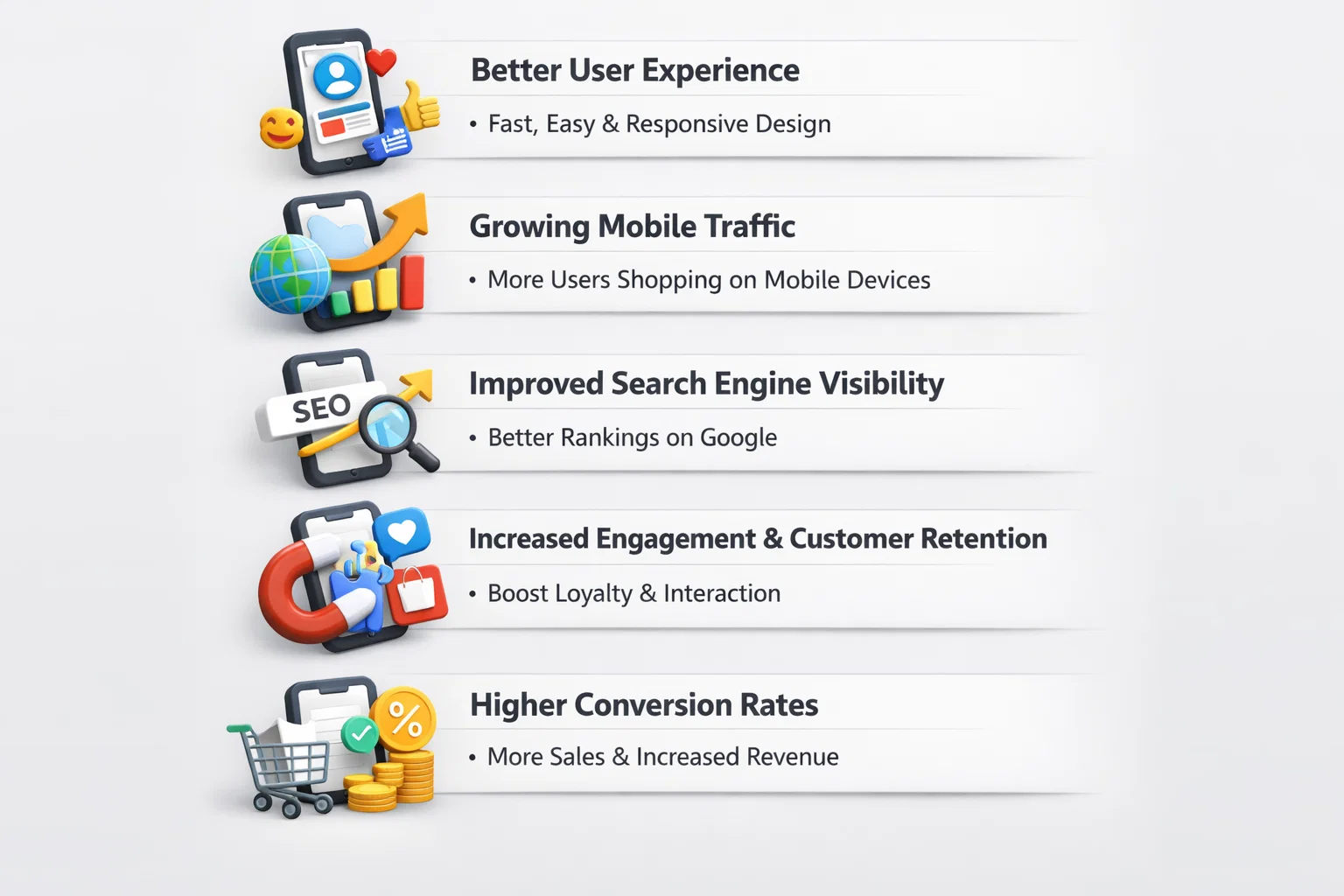
Let’s look at the main reasons why mobile optimisation matters for your Magento 2 site in 2026.
1. Better User Experience
A mobile-optimised Magento 2 store ensures fast loading times, smooth scrolling, and easy navigation. Customers can browse, search, and check out without frustration — no zooming, no endless waiting. A clean design and responsive layout create a friction-free experience that encourages users to stay longer and make a purchase.
2. Growing Mobile Traffic
Mobile devices now dominate the web. Whether it’s browsing, comparing prices, or completing a purchase, customers prefer the convenience of shopping on their phones. Optimising your Magento 2 site for mobile means your products, content, and checkout process all display perfectly on any screen, helping you capture and convert this huge traffic source.
3. Improved Search Engine Visibility
Google rewards mobile-friendly websites. If your Magento 2 site loads quickly and meets mobile usability standards, it will rank higher in search results. Using tools such as the Magento 2 AMP extension can further boost your Core Web Vitals and visibility, giving you an edge over slower, outdated competitors.
4. Increased Engagement & Customer Retention
Mobile optimisation helps you connect with customers in real time. You can use features like push notifications, one-click sign-ins, and mobile-friendly pop-ups to encourage repeat visits. A fast, accessible site also builds trust, something that keeps users coming back and increases lifetime customer value.
5. Higher Conversion Rates
A fast, mobile-friendly checkout can dramatically increase your sales. Shoppers are far more likely to complete their purchase when the process is simple and works smoothly on their device. By integrating Magento mobile optimisation best practices and Accelerated Mobile Pages Magento solutions, you can reduce cart abandonment and boost conversions.
Read more: What Makes Magento the Best eCommerce Website Development Platform?
How to Optimise Your Magento 2 Store for Mobile Users?
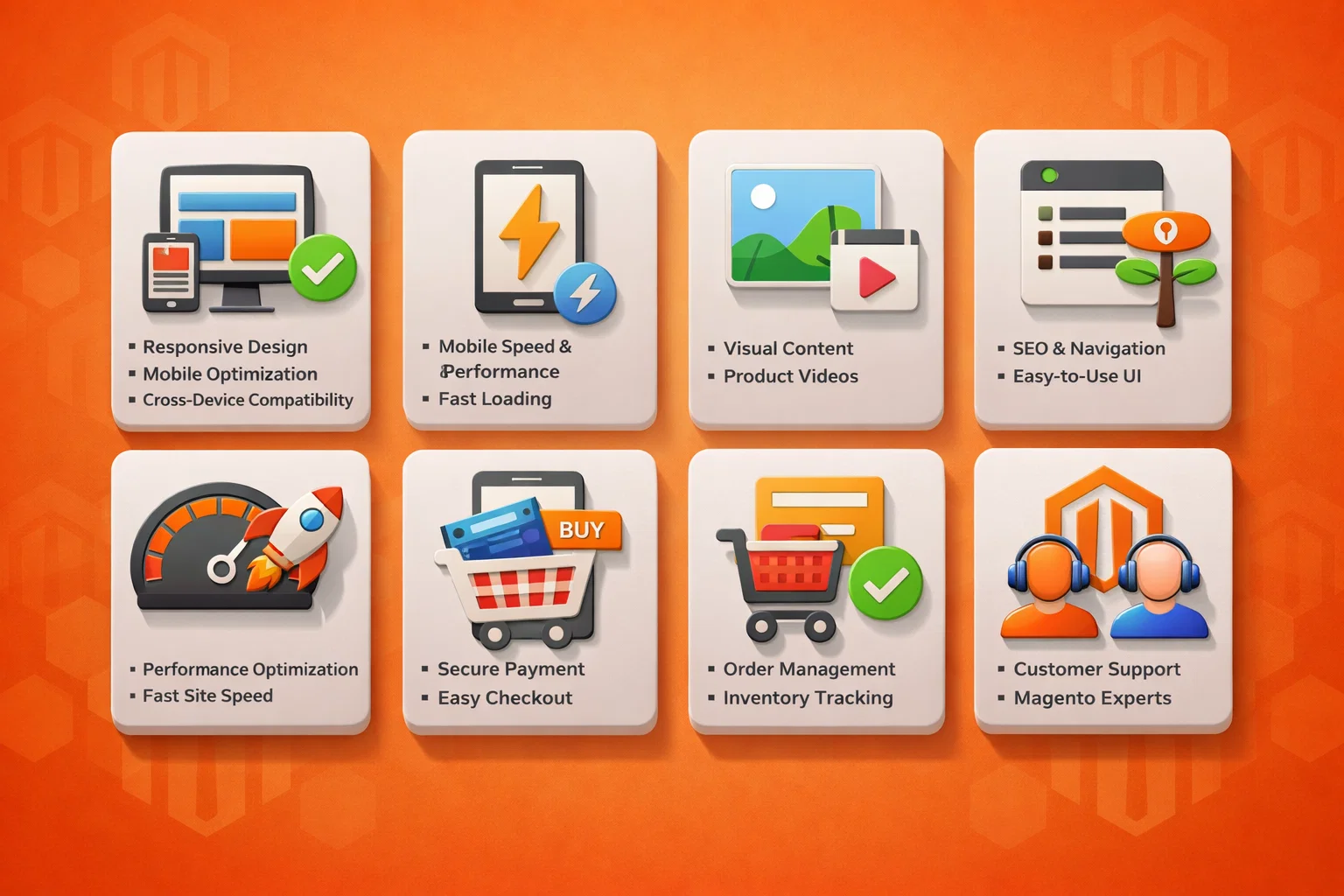
If you want your Magento 2 store to succeed in today’s fast-moving mobile world, optimisation is key. From page speed and visuals to checkout design and AMP integration, every detail affects your customers’ experience. Below are the most effective ways to make your Magento 2 website truly mobile-friendly.
1. Use a Responsive and Modern Design
A responsive design ensures your Magento 2 store adapts smoothly to every screen size, from smartphones to tablets. It’s not just about looks; it’s about usability and SEO. Google now uses mobile-first indexing, meaning your mobile version determines your search ranking.
Choose a lightweight, mobile-first theme from the Magento Marketplace, or hire a Magento design agency to create a custom layout. Test your site across multiple devices to make sure text, buttons, and menus adjust correctly. A good responsive design improves site performance, reduces bounce rates, and enhances your store’s credibility.
2. Implement Accelerated Mobile Pages (AMP)
The Magento 2 Accelerated Mobile Pages (AMP) extension is one of the best tools for faster mobile loading. AMP uses simplified HTML and caching to make pages load almost instantly. This not only improves the user experience but also boosts SEO, since Google prefers fast, AMP-enabled pages.
You can use the Magento 2 AMP extension or hire a Magento development company in the UK to configure it properly. Once set up, your site’s product pages, category pages, and blog posts will load in a fraction of a second, keeping impatient mobile shoppers engaged.
3. Optimise Images and Videos
Images and videos are essential for product storytelling, but they also slow down mobile sites if not optimised. Compress large files using next-gen formats like WebP or AVIF, which offer high quality at smaller sizes. Magento 2 supports various image optimisation plugins that handle compression automatically.
For videos, host them externally on YouTube or Vimeo and embed them instead of uploading directly. Use lazy loading to make images and videos load only when visible. This saves bandwidth, shortens loading times, and delivers a better browsing experience on slower networks.
4. Simplify Navigation for Mobile Users
Mobile screens have limited space, so navigation must be simple and intuitive. Use hamburger menus, sticky headers, and large, touch-friendly buttons. Group similar products under clear categories and avoid cluttered dropdowns.
A clean navigation structure helps customers find what they want faster, reducing frustration and encouraging them to stay longer on your site.
5. Improve Page Speed and Performance
Mobile users expect speed. If your site takes more than three seconds to load, most visitors will leave. Magento 2 includes strong caching features, but you can go further by:
- Enabling full-page caching and browser caching.
- Using a Content Delivery Network (CDN) to serve content faster across regions.
- Minimising CSS, JavaScript, and HTML files.
- Activating lazy loading and asynchronous script loading.
These tweaks together can improve your Magento mobile optimisation score and Core Web Vitals, both crucial for Search Engine Optimisation and user satisfaction.
6. Optimise the Checkout for Mobile
A seamless checkout experience can double your conversion rate. Mobile users want quick and simple payment steps. To achieve this:
- Use a one-page checkout layout.
- Enable guest checkout to skip mandatory sign-ups.
- Add autofill for address and card details.
- Integrate mobile wallets like Apple Pay, Google Pay, or PayPal for fast payments.
Magento 2 also supports extensions that streamline checkout for smaller screens. A friction-free payment flow means fewer abandoned carts and happier customers.
7. Use Magento Extensions Wisely
Magento offers thousands of extensions to enhance mobile usability. Choose ones that genuinely improve performance, such as AMP integrations, caching tools, or UX boosters. Some top options include:
- Magento 2 AMP extension – for faster mobile pages.
- Lazy Load extension – for optimised content loading.
- Progressive Web App (PWA) Studio – for app-like experiences.
Before installing, test each extension to ensure it’s compatible with your theme and doesn’t slow your site.
8. Partner with Magento Experts
If mobile optimisation feels overwhelming, work with a trusted Magento 2 development company. Experienced developers can audit your store, apply best practices, and configure AMP and caching correctly. Partnering with experts ensures your store is not only mobile-friendly but also secure, scalable, and ready for long-term growth.
Common Mobile Theme Challenges in Magento 2 and How to Fix Them
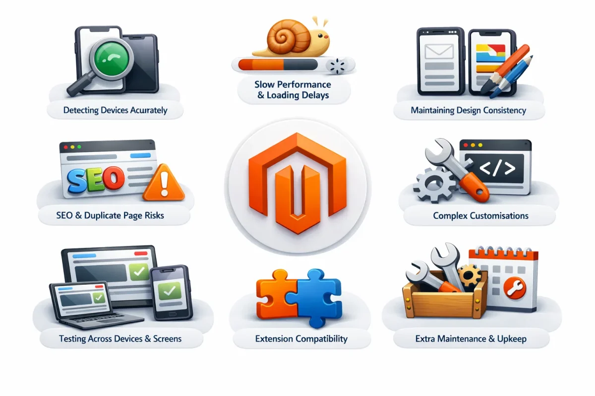
Even though Magento 2 makes it easier to create responsive stores, many businesses still face challenges when using different themes for mobile devices. Let’s look at Magento 2’s common issues and practical ways to solve them.
1. Detecting Devices Accurately
Sometimes, Magento struggles to correctly detect mobile devices, which can lead to the wrong theme being applied or pages displaying oddly.
Fix: Use updated device detection libraries or Magento extensions that handle user agents more reliably. You can also use Magento’s built-in Design Exceptions feature (found under Content > Design > Configuration) to assign themes to specific device types. Always update the user agent list to include new phones and tablets released each year.
2. Slow Performance and Loading Delays
Switching between desktop and mobile themes can add extra load time and increase server use, a major problem for shoppers on slow connections.
Fix: Optimise both themes for speed. Compress images, remove unnecessary scripts, and enable caching tools like Varnish Cache or Full Page Cache. Also, activate lazy loading so that images and videos load only when needed. In 2025, most high-performing Magento stores use CDNs (Content Delivery Networks) to cut global latency.
3. Maintaining Design Consistency
It’s easy for mobile and desktop versions to look different, especially when managing two separate themes. This inconsistency can confuse customers.
Fix: Use shared CMS blocks and widgets wherever possible. Keep branding elements, fonts, and colours uniform. Test across devices regularly to ensure layouts and key features behave consistently. Maintaining a shared codebase also reduces design drift between versions.
4. SEO and Duplicate Page Risks
If desktop and mobile themes generate separate URLs or vary in content, search engines may view them as duplicate pages, hurting your SEO rankings.
Fix: Stick to a single URL structure for all devices. Add canonical tags to identify your main page versions. Follow Google’s mobile-first indexing rules — in 2025, Google primarily ranks sites based on their mobile experience, not the desktop one.
5. Complex Customisations
Designing and maintaining two different themes often leads to coding conflicts and longer development times.
Fix: Start with a mobile-first approach, design for small screens first and then scale up for desktops. Use modular CSS and JavaScript files so developers can adjust individual sections without affecting the full theme. Always test updates in a staging environment before going live.
6. Testing Across Devices and Screens
New devices are released every year, making it hard to guarantee your Magento site looks perfect on all of them.
Fix: Use testing tools like BrowserStack, Google’s Mobile-Friendly Test, or Lighthouse. Combine this with manual testing on popular Android and iOS devices to ensure smooth browsing, functional menus, and quick checkout.
7. Extension Compatibility
Not every Magento extension adapts well to mobile themes. Some can even break site layout or functionality.
Fix: When installing new extensions, check whether they support responsive layouts. Work closely with your developers or extension providers to confirm mobile compatibility. Test thoroughly before deployment to avoid performance issues.
8. Extra Maintenance and Upkeep
Running separate themes means double the updates, patches, and testing, which can drain time and resources.
Fix: Where possible, reuse CSS, JavaScript, and design assets across both themes to simplify updates. Keep detailed documentation for each version, and plan theme upgrades during low-traffic hours. If maintaining two themes becomes too heavy, consider moving to a Progressive Web App (PWA). PWAs offer a single, fast, and responsive experience across all devices, without the hassle of managing separate themes.
Read More: Consideration for Choosing the Right Magento 2 Theme
Conclusion: Building a Future-Ready Mobile Store with Magento 2
Creating a mobile-friendly Magento 2 store is no longer optional, it’s the standard for success in 2026. With mobile commerce now accounting for nearly 75% of global eCommerce sales (according to Statista), every click, scroll, and swipe matters. A smooth and responsive design ensures that customers can explore, compare, and purchase easily, no matter what device they use.
Magento 2 gives businesses a strong foundation with its responsive themes, built-in caching, and flexibility to integrate mobile-first extensions. But real success comes from how you use these tools. Keep your store lightweight, prioritise loading speed, simplify checkout, and test your site regularly across devices.
Remember, mobile optimisation isn’t a one-time task. It’s an ongoing process that adapts as customer behaviour, devices, and search algorithms evolve. By focusing on mobile experience today, you’re not just improving usability, you’re building loyalty, trust, and long-term growth.
If you need expert help to make your Magento 2 store faster, cleaner, and fully mobile-ready, our Magento specialists at IDS Logic UK can assist you. We’ve helped businesses across industries transform their online stores into high-performing, mobile-first experiences that convert better and rank higher.
Frequently Asked Questions
Q1. How often should we test our Magento 2 store for mobile performance?
Ideally, run a full mobile performance test every few months or after major updates. Use tools like Google Lighthouse, PageSpeed Insights, and BrowserStack to check load time, navigation flow, and mobile responsiveness.
Q2. Does Google penalise Magento stores that aren’t mobile-friendly?
Yes. Since Google’s mobile-first indexing is now the default, websites that don’t perform well on mobile may drop in rankings. Optimising your Magento 2 store for mobile directly boosts SEO visibility and user engagement.
Q3. Can we use Progressive Web Apps (PWA) instead of separate mobile themes?
Absolutely. PWAs are a great way to unify your website and mobile app experience. They load faster, work offline, and feel like a native app, all while using the same Magento backend. It’s a smart long-term investment for businesses aiming for better mobile engagement.
Q4. How can we speed up our Magento store on mobile without redesigning it?
You can optimise speed by enabling full-page caching, compressing images, switching to a lightweight theme, and reducing third-party scripts. Also, consider using a Content Delivery Network (CDN) for faster global access.
Q5. What’s the most common mistake businesses make in mobile optimisation?
Many focus only on visuals and forget usability. Fancy graphics won’t help if buttons are too small or checkout takes too long. The goal is a simple, intuitive mobile experience that encourages users to stay, browse, and buy.